
Tuesday, 23 March 2010
Puma
Some background information on the company and the kind of style they have and the ads they produce. The adverts are based more on the trainers and clothing than the brand itself. I like the ads which involve more of the trainer such as the running track and shoe laces i think they are a bit more engaging and different.
Existing Maps


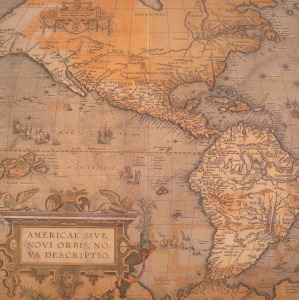
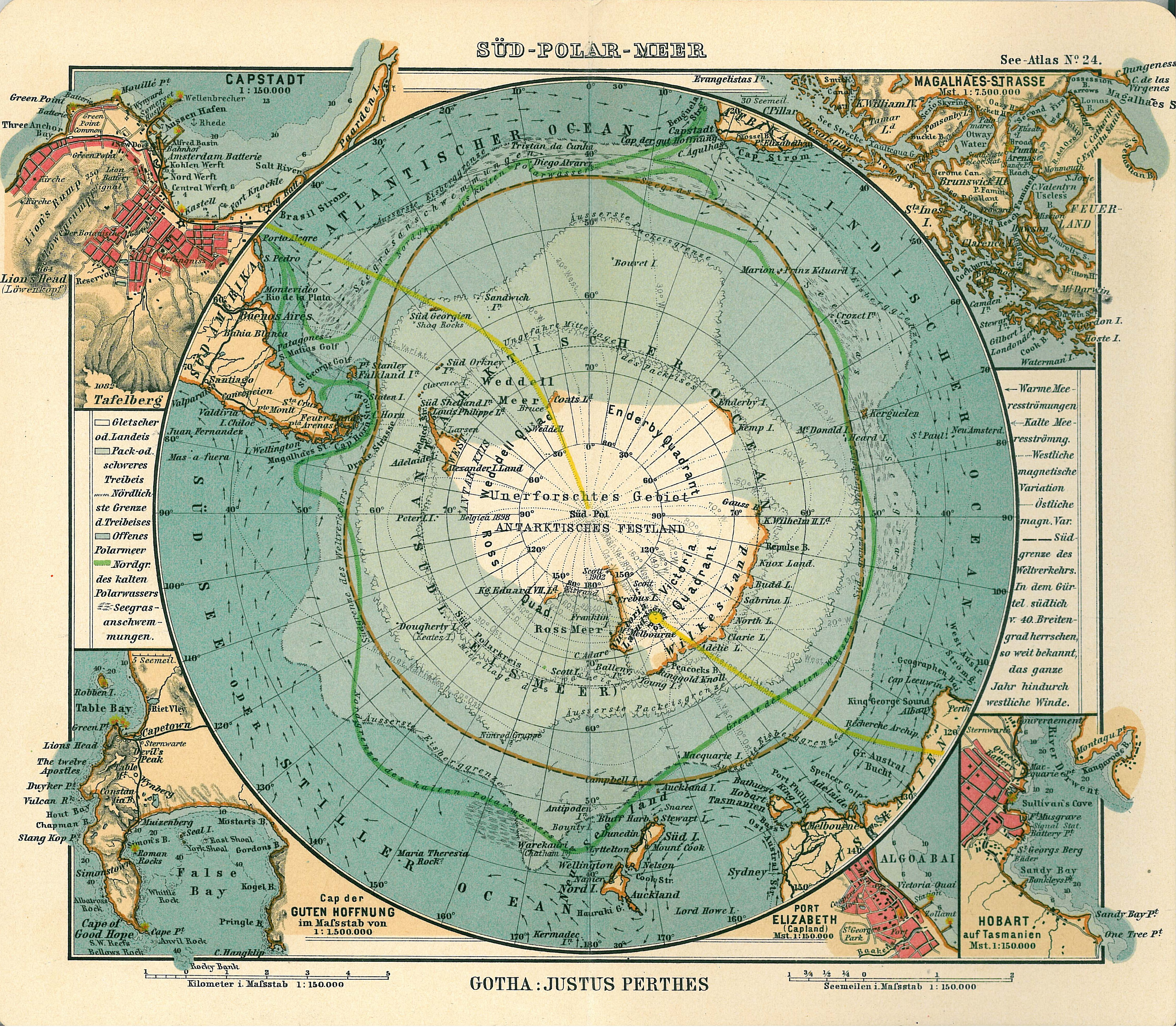

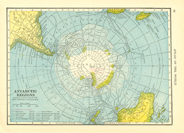

I started looking world maps and maps of the antarctic to help me get a general idea of what needed to included in the design, such as scale, contours, land height, longitude and latitude lines and title and description of the map.
Friday, 12 March 2010

Examples of explorer food


Unused supplies remain frozen on the shelves of their huts, preserved by the cold for 100 years.
Wednesday, 10 March 2010
Benedict Redgrove


I don't feel that its essential for the photo to have a particular message behind it. Much like Redgrove's photos I don't feel that there is a message behind the photography but i feel he makes the subject more interesting than it really should be.
A design Process


Monday, 8 March 2010
Dan Tobin Smith Photography


I particularly like the use of layout and perspective with these photos as they both used at their best. It does show the amount of consideration i need to be taking in terms of the layout of the image and use of perspective more within my ideas.
Olly Moss


I like the idea of reducing things to their simplest elements and feel that this informs me to try to take that approach which i feel is more effective at getting an idea across.
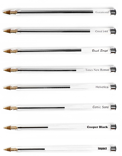
economical type faces
Matt Robinson in collaboration with Tom Wrigglesworth compared a selection of the most commonly used typefaces for how economical they are with the amount of ink which they use at the same point size. Large scale renditions of the typefaces were drawn out with ballpoint pens, allowing the remaining ink levels to display the ink efficiency of each typeface. Measuring Type.
Although I'm not particularly interested in ethical design i feel that this is quite an interesting find and could influence me in choosing fonts in future if the brief requires a more ethical approach.
Swiss Miss
Michael Osborne Design
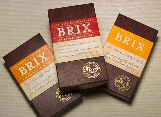
I feel that use of other materials besides paper adds to the quality feel of a piece of packaging. Wood I feel greatly gives the impression of something which is a bit luxurious and costly. I feel that the touches of gold only further this perception as does the more scripted font.


boaboca gourmet
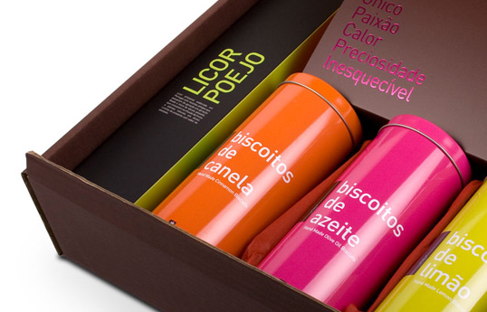


I like the use of colour to divide up the various flavours and it does make it clearer to see the differences between them and keeping the layout exactly the same across each of the flavours does help keep some consistency.


Hatch Design

An example of tinned packaging design which i feel works well and the use of the tin gives the design a sense of quality which isn't as apparent in more paper based packaging.
Subscribe to:
Posts (Atom)