Thursday 20 May 2010

Store brand Food

Tesco

Morrisons

Sainsbury's


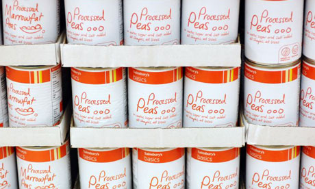
I prefer the sainsbury's design as it feels more personal and basic becuase of the illustrated style.  I feel it adds quality to the range which otherise comes across through other store brands as being a bit too corporate which i feel that when looking too coroporate for value and similar ranges i feel it looks cheap in a way which ditracts the consumer from really considering buying it.

Think bike designs


I feel that the existing colours work quite well for the existing style. But i not sure on the overuse of the yellow and feel that it is something which could work if it was toned down a bit so it added contrast more where it was nessaccary. I feel that there is a need to have more impact within the designs as i feel that the current designs don't seem to get across the dangers of not watching the road properly. I feel that their is a slight inconsistancy with the images used and type choices.

Think Bike TV Adverts


Out of the three adverts i feel the bottom one is the strongest at getting across the message to be more aware on the roads primarily because of its impact and more serious and realistic tone compared to others which i feel are light on the subject

Air freshener/Keyring Designs

I don't really find these designs for air fresheners particularly influential as they aren't really that interested and the style is quite minimal. More effort seems to go into key rings though their is alot of rubbish designed ones.

Ambient Sports Ads


I like the use of the existing environment to expand an idea and i feel it improves the way someone sees a brand it begins to come across as being quite fun and a more engaging brand. I Like these but not the street signs so much as its something you can't really see to well espcially the little tag coming off the trainer stickers.

Puma Brand Guidlines

addidas posters


Addidas' style comes across as being very similar to Nike in the the way they present themselves and can see from looking at aspects of the design styles from the companies that PUMA does come across as being slightly different. I feel that PUMA wants to focus on the brand rather than the product like the other brands, especially within this brief.

Nike Posters

I like the vibrancy of the top design. The others feel empty and don't seem to get across any excitement and its the reason i didn't pursue that style as an option.

Wednesday 5 May 2010

Food Packaging

Co-Op


After looking at some of the photos i took of the packing its clear that its inconsistent with the branding they've currently adopted. I think the designs look dated and are a bit boring.