I like the vibrancy of the top design. The others feel empty and don't seem to get across any excitement and its the reason i didn't pursue that style as an option.
After looking at some of the photos i took of the packing its clear that its inconsistent with the branding they've currently adopted. I think the designs look dated and are a bit boring.
The simplicity of these designs is something that i've managed to continue in my own designs and feel that it is what allows it to look somewhat more expensive.
Some background information on the company and the kind of style they have and the ads they produce. The adverts are based more on the trainers and clothing than the brand itself. I like the ads which involve more of the trainer such as the running track and shoe laces i think they are a bit more engaging and different.
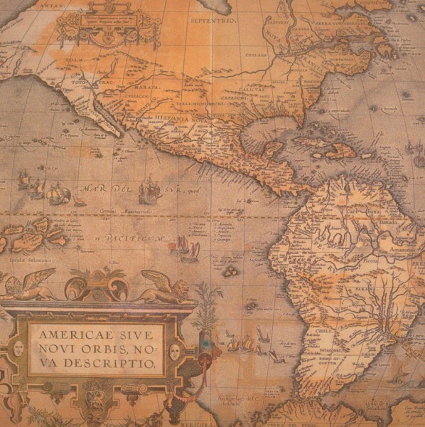
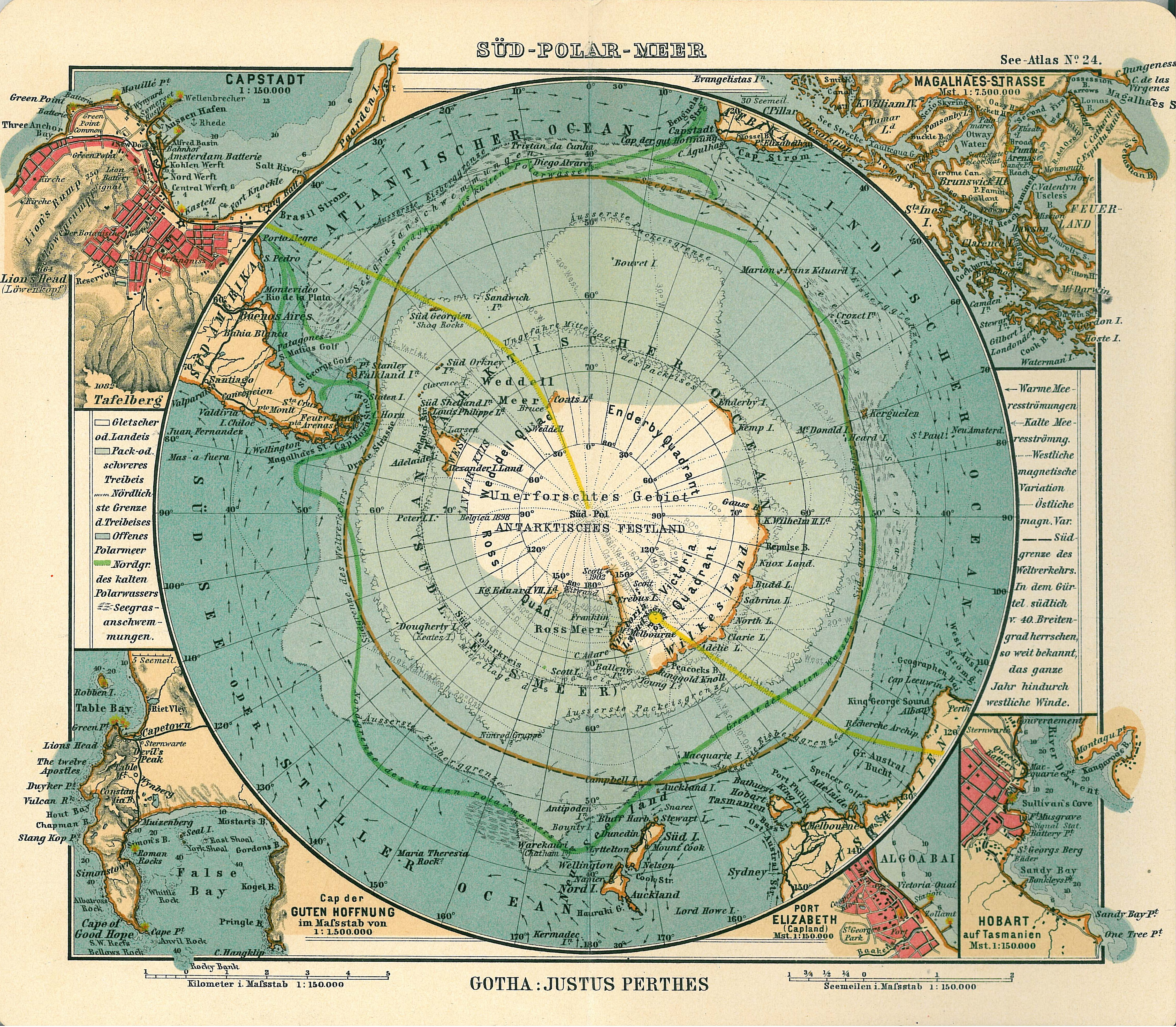
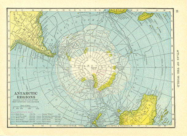
I started looking world maps and maps of the antarctic to help me get a general idea of what needed to included in the design, such as scale, contours, land height, longitude and latitude lines and title and description of the map.