skip to main
|
skip to sidebar
Monday, 8 March 2010
boaboca gourmet
http://www.boaboca-gourmet.com/
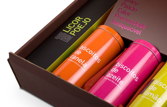
I like the use of colour to divide up the various flavours and it does make it clearer to see the differences between them and keeping the layout exactly the same across each of the flavours does help keep some consistency.
No comments:
Post a Comment
Newer Post
Older Post
Home
Subscribe to:
Post Comments (Atom)
About Me
Karl Cartwright
Currently doing BA (Hons.) Graphic Design at Leeds College of Art
View my complete profile
Pages
Design Practice
Design Context
Context Book
PPD
FMP
Tags
Bakery
(3)
castrol
(10)
co-op
(3)
Crisis
(5)
Events
(8)
Fortnum and Mason
(13)
Lloyds
(8)
puma
(6)
think
(3)
Blog Archive
▼
2010
(61)
►
May
(10)
►
April
(2)
▼
March
(15)
Puma
Existing Maps
box packaging
Examples of explorer food
Benedict Redgrove
A design Process
Dan Tobin Smith Photography
Olly Moss
economical type faces
Michael Osborne Design
Poster Design
boaboca gourmet
Work by Drew
Design Project
Hatch Design
►
February
(13)
►
January
(21)
►
2009
(30)
►
December
(4)
►
November
(6)
►
October
(14)
►
September
(6)


No comments:
Post a Comment